---
title: Case study of button states
date: 2020-05-18
tags: [code, html, design]
description: I still don't really have a good idea about how to style different button states. So I did a quick comparison of some toolkits from different eras.
---
I still don't really have a good idea about how to style different button
states. So I did a quick comparison of some toolkits from different eras.
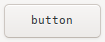
- hover
- Typically a slight color variation. Win 98 is interesting because it has no hover styling at all. Win XP is interesting because it uses an outline which is otherwise mostly used for focus.
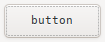
- focus
- Typically an outline. This way it can easily be combined with other states. Browsers have default styling for this
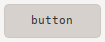
- active
- Typically a 3D effect like shadows or gradients (or the lack thereof). Flat designs like that of bootstrap or materialize struggle to differentiate this from other states.
- disabled
- Typically reduced contrast. Disabled buttons typically ignore the other states.
So in summary: Focus and disabled are pretty much set in stone. Active should
be clearly distinguishable. In comparison, hover styles are way less relevant
and should only be slight variations.